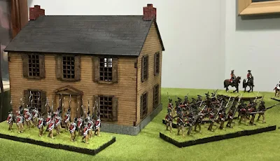
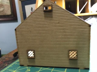
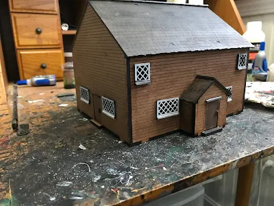
For those of you that may buy the historical New England buildings from "Things from the Basement" and are curious how to paint them here is some historical information I found. The following information was from the Ipswich Historical Society web page. The original article can be found here: https://historicipswich.org/colors/)
This is a great guide they created to help home owners paint their older homes to stay within the colonial period. Please consider that this guide is for New England. Other regions of the colonies and Canada were different both in architecture and style. Also that this is just a guide and not a definitive end all authority. I have followed it in my painting for houses for my American Rev War and War of 1812 houses. I post it here to explain why I did what I did and to help out others. If you have different or other information please feel free to drop me a line. I am always interested in learning more.
COLONIAL AND FEDERAL period from 1640-1840. Paint was used on the three main parts of Colonial and Federal houses exteriors. These were:
Body: the walls – usually clapboarded or shingled, sometimes boarded.
Trim: the decorative woodwork that framed the large wall surfaces and often the smaller elements such as windows and doors.
Sash: The movable elements – doors, windows, shutters.
Period houses rarely painted trim and sash in different colors and so were generally of two colors only; later styles often had three.
Colonial Period (1640-1780)
Architecture: asymmetry, verticality. 17th-century colors were derived from earth, stone or other natural pigments.
Body: clapboards, originally not painted or stained but weathered to dark brown.
Trim: Unpainted or painted red/ brown to contrast with unpainted body.
Second Period or Georgian (1725-1780)
These houses favored stronger colors from naturally derived pigments. Colors imitating stone construction were popular exteriors, interiors were bolder and brighter than once thought.
Modest and rural houses often not painted. Strongly contrasted color schemes favored.
Body: dark stone colors, chocolates, orange, ochers, greys and reds.
Trim: Almost always white, but a softer, yellower white than today’s white. Cornices, window and door casings, cornerboards and molded details often simulated stone – pale grey, yellowish-white, very pale blue, sometimes with sand blown into the wet paint.
Doors: always dark color – chocolate, red, green or blue.
Roofs: occasionally red, chocolate or yellow
Federal Period (1780-1830)
Fashionable taste moved away from the more robust Georgian toward lighter colors: white, off-white, pale shades of stony gray, and ochre. Bright, clear tones in interiors, often in contrast with pale trim – creams, pumpkins, sage green, muted blues etc. The 1812 painting guide by Hezekiah Reynolds of CT advised a palette of “white, cream, straw, orange, pea-green, parrot green, grass green, red, slate and black.” Lighter colors were fashionable, but darker ones were still used for more traditional tastes. Contrasts were less marked than on Georgian houses.
Body: White, cream, straw were fashionable, but orange, pea-green, red, slate met more conservative, traditional tastes.
Trim: White, or sometimes the same color as the body. Shutters and doors were dark green or black.
House fronts were sometimes painted in fashionable, lighter (and more expensive) colors, while the back and/or the sides were in the more traditional, and cheaper, reds.
Rural houses were often unpainted until the middle of the 19th century


